Showing posts with label urban transport. Show all posts

Friday, March 21, 2014

OPAL CULT - SYDNEY'S $1BN TRANSIT SMARTCARD


Opal smart card at Circular Quay Sydney
Opal staff hand out fliers at Circular Quay- note the interchange signage in the background (DRC)
“Cheaper fares with Opal!” say the more enthusiastic promotions people, echoing the text of the flyers they hand out at Sydney’s Circular Quay commuter wharves. It is an ironic choice of location. Circular Quay is Sydney’s only tri-mode bus, ferry and rail transit interchange.  Here more than anywhere else, commuters are going about a modal interchange, in many cases to the third mode of their journey. A feeder bus, a ferry and a train is not a rare itinerary.

It is these interchanging passengers who are to endure the greatest fare increases under Opal. It is little wonder that the Opal team have had to ramp-up the propaganda; as commuters come to the realisation that the new smart-card penalises them for their modal interchange, they are less willing to abandon their old zone-based multimodal mag-stripe tickets.

General comparisons between the old multi-modal tickets and Opal are difficult, because of the sheer diversity of multi-modal journeys. It is with this problem in mind that Jani Patokallio developed OpalOrNot.com in his spare time. A complete web-app with the sole purpose of cutting through mind-numbing complexity of calculating the comparative prices of Sydney transit fare options.

OpalOrNot.com screenshot for a typical two mode commute (15/3/2014)
Patokallio observes that for many multi-modal journeys, costs will significantly increase. This is the most recent change in a ten-year history of Sydney's transit pricing increasingly favouring long single-mode journeys, at the expense of short multi-modal journeys.

While the press-releases of governments of both persuasions have been laden with pro-integration rhetoric (and have even restructured and rebranded the transit instrumentalities to appear integrated), fare structures increasingly impede integration.

What Was the Point of Opal?


The story of Opal is one borne out of a political response to the previous Government's abortive attempts to implement T-Card integrated ticketing. The broader narrative around the need for a new "integrated ticketing" smartcard system has its origin in a 1996 major Inquiry by the newly-formed Independent Pricing and Regulatory Tribunal (IPART). IPART observed that integrated ticketing could improve the flexibility, convenience and accessibility of transit  [5] and that a smartcard system could enable the delivery of integrated ticketing.

The then Government's response was included in its 1999 'Action for Transport' plan, a central pillar of which was to develop an integrated ticketing system, expanding a combined intermodal fare structure beyond the then existing ones in inner-Sydney to the privately operated areas in the outer West and Illawarra. Between 1999 and 2010, consecutive Labor Governments grappled with implementing the technology to deliver integrated ticketing, culminating in the collapse of the T-Card integrated ticketing project, and the near bankruptcy of Australian technology company ERG. In April 2010, after the failure of T-Card, the then Labor Government awarded the contract for a new smartcard system to the Pearl Consortium.

Amidst the mire of T-Card's challenges, the original intention of improving the "flexibility, convenience and accessibility" of transit was somehow lost. As early as the year 2000, Australian transport researcher Paul Mees was sceptical of the New South Wales Government's characterisation of its integrated ticketing project:

“In Sydney there is still no discussion of a genuinely multi-modal fare system. Instead what is proposed is an electronic ‘smart-card’ which makes it easier for passengers to pay a separate fare for each mode used…” [4]

In 2003 a Ministerial Inquiry into Sydney's transport, led by the chairman of IPART responsible for Sydney's transit fares,  redefined Integrated Ticketing as "The use of a single stored value card to purchase travel (referred to as the ‘smart card’)" [6]. This belief that "integrated ticketing" was nothing more that a unified contactless charge card spread throughout the transport administration, and the entire T-Card project was effectively redefined as one with the purpose of producing an electronic purse for transit, rather than an integrated multi-modal pricing regime.

When the new Liberal State Government was swept to power in 2011, it inherited the smartcard contract awarded by the previous government. The new government nonetheless had a very clear mandate and motivation to get a system in place that lived-up to the ticketing systems that Sydneysiders often see interstate and overseas (with the thought "why can't we do that in Sydney?). In September 2011, the press release came unveiling the new ticketing project:

"MEDIA RELEASE
OPAL A GEM FOR PUBLIC TRANSPORT
London has the Oyster, Hong Kong has the Octopus, and Sydney will have the Opal.
Transport Minister Gladys Berejiklian today announced the Australian national
gemstone would find its way into the pocket of public transport customers in the form of the new electronic ticket."

As with the wayward T-Card after about 2003, the Opal project sought to imitate international examples like London's Oyster. But with the original purpose of integrated multi-modal fares lost amidst its highly political rebirth, it has struggled to get beyond replicating superficial form.


Superficial Form: Solutionism and Cargo Cults


In his recent book “To Save Everything Click Here”, Evgeny Morozov wrote on the problems of what he calls “solutionism” and “internet centrism”. An aspect of his argument is that the internet has formed a reality distortion field, whereby things that the technology of the internet can enable are assumed to be inherently desirable.

“Ironically, in addition to sanctioning the hideous ideology of ‘solutionism’, with its never ending quest for solutions to often non-existent problems, Internet-centrism is beginning to block our ability to think of effective technological solutions to problems that do exist. Solutions are not addressed based on their merits but rather on how well they sit with the idea of [The Internet]” [1]

It struck me while reading Morozov that the phenomenon he described was applicable to other technologies with a political dimension: that any technological centrism can block our ability to think of effective solutions to actual problems. It also reminded me of a related concept described by Nobel-winning physicist Richard Feynman in his 1974 Caltech Address.

“In the South Seas there is a cargo cult of people. During the war they saw airplanes with lots of good materials, and they want the same thing to happen now. So they've arranged to make things like runways, to put fires along the sides of the runways, to make a wooden hut for a man to sit in, with two wooden pieces on his head to headphones and bars of bamboo sticking out like antennas--he's the controller--and they wait for the airplanes to land. They're doing everything right. The form is perfect. It looks exactly the way it looked before. But it doesn't work. No airplanes land. So I call these things cargo cult science, because they follow all the apparent precepts and forms of scientific investigation, but they're missing something essential, because the planes don't land.” [2]

All aboard the Opal plane: A Melanesian "cargo cult" with their aeroplane, but alas, no cargo
Both of these concepts describe the outcome of a mental shortcut: the recognition of, and focus on, a superficial form. In Morzov’s description of “Internet Centrism” the logical error is that because something has a superficial form that aligns with the superficial form of other good things enabled by the same technology, it too must be good. In Feynman’s description of “Cargo Cult Science” the logical error is the belief that replicating the superficial form of complex system produces the same outcome as the complex system.

A focus on technology and infrastructure (and its appearance to the electorate) rather than an operational outcome is not an unusual problem in transit. Paul Mees touched on the dynamic in the field of transit in his thesis “A Very Public Solution”, observing that, in order to improve transit:

“Many of the preoccupations and conventional wisdoms of traditional public transport planning will require reconsideration or rejection if real change is to take place. Infrastructure and technology fetishism will have to be abandoned, although getting technological decisions correct remains important.” [3]

Sydney’s new Opal card has fallen victim to phenomena described by Morozov and Feynman. The outcome is over $1bn being spent on technology that does not solve a problem, but rather replicates the superficial form of successful revenue collection systems like London's Oyster. Opal has the contactless smartcards, the backend data warehouse, all the visible physical form of systems like Oyster, yet is missing something essential- the fundamental mechanics of an integrated fare system.

Integrated Fare Systems


The two dominating considerations in commuter travel are how long it takes, and how much it costs. These are the major elements of what transport planners call Generalised Cost, the value which travellers compare across the various travel options they can use.

These are linked, by virtue of the different attributes of different modes of transportation. A short, low patronage, local trip is best served by a car or bus. If you want to reliably and quickly move 30,000 people per hour in a single lane over medium to long distance you'll need a train. If you want to go over water without a bridge, you'll need a ferry. And the fastest journey for most people would involve a combination of these. But if you apply a cost to each of these component trips independently, you very quickly destroy the Generalised Cost value proposition of the door-to-door journey.

For this reason defining pricing of urban transport around accessibility, rather than around individual trips on individual modes, is necessary to provide the equitable Generalised Cost and price signalling supporting the free interchange of passengers between modes of different scale. Integrated ticketing aggregates the network access or flag fall component of cost across a product called mobility rather than a product called a ride on a bus.

Integrated ticketing is of particular importance for transportation modes that do not work very well in isolation. Ferries are the supreme example, being captive to water, there are very few journeys they can serve door-to-door. Being blessed but divided by a wide harbour, Sydney has few harbour transit crossings other than ferries; only two significant rail crossings (the North Shore line and the Main North), compared to say London's 23 rail crossings over or under the Thames.

Accordingly there has been in Sydney a long history, though a piecemeal and declining one, of integration. From the 1930s, there was collaboration between different operators, both private and government, to provide multi-modal services. Often, as with the Balmain to City commute, a faster journey and better use of capital (keeping trams out of slow-moving City congestion) could be achieved by the Government Tramways collaborating with a private ferry operator, offering combined integrated tickets at the same price as single-mode (tram only) tickets.

Sydney multi-modal tram and ferry ticket from 1945
A Multi-modal tram and ferry fare from the late 1940s (DRC)


Many cities have now embraced generalised system-wide integrated ticketing based on time and zones, including London's Oyster, with its underlying zone TravelCard system. (I explained the key aspects of London's time and zone system which underpin Oyster in this post on Opal and Oyster).

There was a long (30 year) gestation for the concept of integrated zone fares in Brisbane leading up to 2003, which concluded in ultimately successful lobbying by groups such as The Brisbane Institute and Queensland Conservation Council. Transport planner Eric Manners was a key author behind community-interest lobbying such as this one from SmogBusters. In it Manners identifies a succinct recommendation from consultants and transit revenue experts Wilbur Smith & Associates which is as relevant to Sydney today as when published in Brisbane in 1970:
"The efficient and economical operation of public transport requires full coordination of services, the elimination of wasteful duplication and the use of each type of transport vehicle and system to meet the particular needs it can best serve"
US Transit planner Jarrett Walker described a similar challenge in specific relation to Sydney in 2010:

"My basic view of connection penalties has always been this:  The connection is not an added convenience for which the customer should pay extra.  It's an inconvenience required by the geometry of any efficient, legible, and frequent transit system.  Transit systems must therefore do what they can to minimize this inconvenience and encourage people to make connections.  Connection fare penalties are exactly contrary to this imperative."

Few have explained the importance and rationale of integrated transit pricing as clearly as Dr F Pampel, Director of the Hamburg Transport Authority (HVV). The HVV was the pioneering example of an authority overseeing an integrated approach to multi-modal operations across more than ten operators, most of which were private enterprises. They pioneered multi-modal integration, inspiring similar celebrated transit systems like Zurich's ZVV. In 1967 Pampel presented a paper to the Union Internationale des Transports Publics (UITP):

"The essential prerequisite for the desired integration of transport in the Hamburg area was a passenger fare system with uniform rules of price calculation and tariff provisions for all the services in the Community... 
When the fare system was worked out, great importance was attached to identical prices for broken and continuous journeys of the same length in view of the large number of broken connections resulting from the transport network structure with the rapid transit systems as the main carriers and the buses as feeders and distributors. The joint fare system allows passengers to change vehicles as required. All fare barriers existing between different operating branches and undertakings have been eliminated. All services in the Community are offered to the passenger under a unified fare system." [7]


In some cities the principles set out by Pampel have only been achieved with arrival of newer generation technology. It was indeed the Oyster Prestige smartcard in London that enabled an electronic purse with an upper limiting zone fare defined by the TravelCard zone system. It was the GoCard smartcard that enabled the implementation of Brisbane's Translink zone system. It was the Clipper Card that enabled San Francisco's MUNI to role together time-based multi-modal fares with the Bay Area Rapid Transit's fare system (previously a confusing paper-based transfer system).

It is perhaps for this reason that there is a Post hoc ergo propter hoc logical error contributing to the cargo cult mentality; that the smartcard itself has become the object of desire, rather than the fundamental and unfortunately prosaic pricing structure and revenue-division framework at its foundation. As understandable as it is, it is an error that needs be corrected if Sydney's transit system is ever to become an integrated one.

Actions and Words

In the introduction I included a screenshot from OpalOrNot.com, showing a fairly typical combined ferry- rail journey increasing $827 or 36% from $2293 to $3120 for a year of travel. This in itself is a damning contradiction of the "Opal Fares Cheaper" press releases.

Ministerial Press Release "Opal Fares Cheaper" 12/12/2013


But if we look over a longer period we see an even greater discrepancy between single-mode and multi-modal journeys, particularly those involving a ferry.

Above: Per Cent increase of Sydney transit weekly fares, single mode and multi mode over ten years to 2014, without Opal and with Opal (full backing sheet, inputs and sources are available in this spreadsheet)

There are two important things revealed in the above graph:
  • Long single-mode journeys have increased at (or at less than) inflation for the last ten years, ferry fares have increased about 60% (double CPI) and multi-modal fare price has more than doubled in ten years, with a 107% price increase (more than triple CPI)
  • Single mode journeys enjoy a moderate price decrease under Opal, multi-modal fares suffer a significant price increase
It is also interesting to note that ferry fare have massively outstripped rail fare increases, despite ferries consistently maintaining a higher cost recovery [8]. This graph is not comprehensive. There are some cases that are better, and some far worse. But it is illustrative of a fundamental disconnect between what policy allegedly aspires to, and what is actually happening. The bureaucratic response is to downplay the number of people affected, according to Sydney Morning Herald journalist Jake Saulwick:

"Transport for NSW says that its analysis shows that just 7 per cent of people would pay more under the Opal, with another 7 per cent potentially paying more. Those paying more would typically be people who buy monthly, quarterly or yearly public transport tickets.
But the department has consistently refused to release the full analysis upon which these figures are based."

Whether it just effects 7% of people now is hardly the point. Given the massive price differential that has established between mutli-mode and single-mode tickets over the last 20 years, it is no surprise that multi-modal fares have declined from over a quarter of total passenger revenue in the late 1980s [9]  to "7% of people" today. That does not tell us how many people are not using transit, or are using a fare-minimised route rather than time-minimised or "optimal use of infrastructure" combination of buses, trains, ferries and trams.

Not only does $1bn worth of smartcard technology not support multi-modal pricing, it makes multi-modal journeys considerably more expensive than single-mode journeys. In this central functional respect, Opal is the polar opposite of integrated zone-based ticketing systems like London's Opal, and even Brisbane's GoCard and Perth's Transperth tickets.


The outcome


No doubt the focus will stay on the expensive technology, because like the fires on the runway, the superficial appearance is what gets noticed by the casual observer. There will be self-congratulatory back slapping and perhaps even more "smart infrastructure" awards acclaiming the success of the rapid Opal smartcard rollout. And from a hardware rollout point of view, it has been a remarkable turnaround. The success of this technology project- of quickly and successfully setting the fires along the runway, and donning the coconut headphones in the bamboo control tower, is immense.  But Opal delivers none of the central benefit of integrated ticketing systems after which it is superficially modelled, at a greater cost.

In fairness, Opal can be credited with two achievements: replacing life expired-technology (like on-board bus magnetic stripe systems) and improving revenue tracking to non-gated rail stations. Whether the two practical outcomes warrant over $1bn expenditure on smartcard technology is highly doubtful, particularly as smart-card systems are now being superseded by low-capital mobile technology such as that recently rolled out on Boston's MBTA.

Price signals blocking multi-modal transit are subtle and sinister in their effects. By way of just one example: commuters stop catching the bus to the train station, they drive instead. The car park fills up, the road becomes congested. Patronage of the feeder bus drops. Bus revenue falls. The operator reduces service levels. The bus becomes less attractive to the few remaining people using it because of its infrequency. The Municipal Council is motivated into building a multi-million dollar car park or a bigger car park.

As Transport for New South Wales pushes for more multi-modal infrastructure, such as Sydney's currently under-construction Eastern Suburbs Light Rail, more modal interchange will be necessitated, and cracks in the "one journey on one mode policy" will propagate. Whether there will be the economic impetus (of equitable cost-recovery) or political impetus (of disgruntled commuters), it is conceivable that these kinds of ad-hoc kludges will converge to a geographic zone-based cap.

If the current course of Opal is maintained (replacing multi-modal periodicals altogether with capped trip-based fares), ferries will be particularly hit. Cross-elasticity of demand will draw passengers to cheaper more time-consuming capital and labour-wasting options, such as sitting in buses jammed water-side roads like Spit Road and New South Head Road. And the empty seats will continue back-and-forth on the harbour irrespective.

There is still an opportunity for recovering value from Opal's costly infrastructure. A zone-based system (like Sydney's former TravelPass) could be restored as the capping mechanism for Opal, as TravelCard is for Oyster.  But it requires both leadership and understanding of the issue at hand, of which there has been little evidence to date.


The original version of this post incorrectly indicated that the Opal project was awarded by the current New South Wales Government. In fact the Pearl Consortium which delivered what was subsequently named Opal was awarded the contract by the previous Government. This has been corrected.

[1] p75, To Save Everything Click Here, Morozov E, 2013, Allen Lane/ Pearson, London
[2] Cargo Cult Science, Richard Feynman, 1974 address to Caltech
[3] p289, A Very Public Solution, Mees P, 2000, Melbourne University Press, Melbourne
[4] p288, A Very Public Solution, Mees P, 2000, Melbourne University Press, Melbourne
[5] IPART, March 1996, An Inquiry into Pricing of Public Passenger Transport Services, Fare Structures for Public Transport, Transport Interim Report No 4, p27
[6] p107, Ministerial Inquiry into Sustainable Transport in New South Wales, 2003
[7] p11, The Hamburg Transport Community, an example of coordination and integration in public transport, Dr.-Ing. F. Pampel, Presented before the UITP, 1969
[8] p38, NSW Auditor-General's Report to Parliament- Volume Eight 2013- Transport Overview, 2013, Sydney
[9] p12, Urban Transit Authority Annual Report 1987-1988

Saturday, May 25, 2013

LIES, DAMNED LIES AND TRANSIT KPIs


Is Sydney’s public transport performing well or not performing well? User experience is that it’s not performing well, reflected in frequent news reports, social media outrage and pre-election opinion polling. By contrast, the operator’s statistics indicate Sydney’s rail, buses and ferries are performing well, with consistent high results.

I’m going to explain what “Key Performance Indicators” (KPIs) or “Metrics” are, why they’re important, and what’s wrong with them in the context of Sydney’s urban public transportation (or transit). By way of warning, there will be a bit of what looks like management jargon. Please do not be deterred, I want to stick with the established terminology for consistency.

I’ll contrast the practices of companies working in a competitive environment with the practices of Sydney’s urban transit. I’ll also illustrate by international example that customer focus can be, and has been, replicated in public-sector transit services.

Finally I'll explain why I think the era of rampant misrepresentation of performance is drawing to a close, whether governments, agencies and operators want it to or not.

Why it Matters


The underlying motivation for me writing this is that urban transit performance indicators in Sydney have been gamed. The indicators are more about producing high percentages than telling us anything meaningful. Yet they are used as a basis for judging the effectiveness of investment of tax-payers’ dollars, fare (price) setting and assessing management performance.

Reported success or improvement is rewarded, publicised or used as a basis for fare increases, when in fact many of the reported indicators do not show success or improvement in any meaningful sense (to a customer, investor or economy).

You might expect that the indicators would seek to represent features of performance that are important to users and the success of the transit business. However, this is not the case. And it’s not surprising when incentives around the creation and application of KPIs are not to develop or grow the business, but rather to project success theatre.

A half-hourly Sydney bus departs too full to take on passengers at the Edgecliff rail interchange
A half-hourly Sydney 324 bus departs too full to take on passengers at the Edgecliff rail interchange 
The bus operator, State Transit, reports 99.87% Reliability in Q4 2012 (source)

The present Sydney transit KPIs are almost useless from a management perspective; they do not meaningfully inform management actions to improve customer experience. From a passenger and price-setting perspective they are at best useless and at worst intentionally deceptive. Moreover, meaningless KPIs render it impossible to analyse the (dis)improvement arising from strategic and operational changes.

This is not a problem that is confined to Sydney or transit, indeed it permeates the public sector to the highest level. However, with an active and earnest focus on performance, several transit organisations globally have overcome this bane. Sydney can too.


Yes Minister: The Florence Nightingale Award Used the Wrong Metrics to judge success


Background


In a free, competitive market with multiple participants providing similar services, those participants are typically trying their hardest to improve how they fulfil the needs and wants of their customers.

Access, Glamour, Comfort, Value- Public transport in the competitive era (left: Central London rapid transit c1890 right: US Interstate rail c1950)

In the competitive private sector, performance reporting is important mainly for managers to understand how their business is performing, and to quantify which management actions improve or impede performance and by how much. Performance reporting is also necessary to inform investors or prospective investors of how the business is performing.  Understanding KPIs or Metrics is the livelihood of investors. They want to put their money in companies which meet (or will meet) consumers’ needs better than other companies trying to meet those needs.

Investors therefore seek factual metrics on performance which are an indicator of how the company satisfies peoples’ needs, how efficient it is, how it’s growing and how much money it could make. As a corollary, companies are always seeking to provide those metrics, and finesse them is such a way as to claim as much success as they can.

Whether it is a manager seeking to cast his performance in the most favourable light, or a whole company talking-up its performance pre-investment, companies have a natural incentive to create metrics that overstate performance or success at meeting customers’ needs. These, in the lean startup world, are called Vanity Metrics. A famous example was Groupon’s overstated income described here by the New York Times, so-called “adjusted consolidated segment operating income”.  Informed investors are attuned to the phenomenon and know when to call bullshit.

While speaking on the ineffectiveness of Vanity Metrics, Eric Ries defines “success theatre” as “energy that goes into making people think you’re being successful, rather than ... into serving customers” from this video (2:26-3:06)

In the private sector, performance indicators or metrics are under scrutiny from investors, prospective investors and even journalists reporting on the market.

In government-funded services operating in an uncompetitive environment, or in government-granted monopolies (like exclusive franchised bus, rail or ferry services), performance reporting is especially important. In the absence of market competition, it provides the only means by which performance and return on taxpayer dollars can be judged.

Unfortunately, however, public sector and monopoly transit operators are not under the scrutiny of shrewd investors. There is no individual or institutional investor who stands to gain or loose millions of dollars as a consequence of operational performance being misrepresented. For that matter, given transit operators' monopoly position serving an often captive market, there is often no direct signal from bad operational performance- only what comes back indirectly from the loss of a metropolitan area’s efficiency and productivity, and user (voter) displeasure expressed at the ballot box or in protests.

Taxpayers and voters are so far from the details of this one small part of their collective financial interests, that even when there is occasional scrutiny, there is no driving motivation to overhaul performance statistics of transit operators. For taxpayers, if the experience is bad enough, they’ll  vote accordingly. Unfortunately, on a year-to-year level and on a decision-to-decision level, this gives us no insight into what’s working, what’s not working, and what we are really getting- in objective quantitative terms- for our dollars spent.


Metrics in Sydney’s Transit

I'll delve into a couple of specific examples of KPIs in Sydney, one on buses and one on trains. Both relate to the headline "on-time running" metric.

Back in 2009 the Government's transit price setting regulator (the Independent Pricing and Regulatory Tribunal, IPART) observed on p26 of its Review of fares for metropolitan and outer metropolitan bus services for 2009, IPART:

"Measures of on-time running are largely limited to recording whether the bus leaves the depot on time. IPART has previously noted that this is not a good indicator of the bus network’s actual on-time running performance or the level of service actually experienced by passengers. IPART considers that the inadequacy of this measure makes it difficult to form a meaningful judgement of the change in on-time running performance. "

In 2010, the New South Wales Auditor General produced a report- Improving the Performance of Metropolitan Bus Services. In the conclusions on p3, the Auditor General noted:

“…a lack of performance information has prevented NSWTI from undertaking any comprehensive analysis of the performance of bus services. The proposed new performance assessment regime will be limited to using data already available and will not cover many areas of performance important to bus users. This will continue to frustrate NSWTI’s ability to manage the performance of metropolitan bus services.”

As anyone with an MBA will tell you, if you’re not measuring the performance of what you’re trying to improve, you’re off to a bad start. This would be a damning assessment, were it made by a venture capitalist with regard to an enterprise. If the managers of the company were unable to even understand, let alone demonstrate, the company’s value proposition and performance, there would be concerns for the managements’ competence.

But we find that even two years after that recommendation, the reported data remains largely unchanged. The headline “on time running” metric, despite criticism from both the Auditor General and the Independent Pricing Regulator continues to be defined by a near meaningless criteria:

“The on-time running for State Transit is defined as a bus that starts its trip between zero to 5 minutes after the scheduled departure time.”

(p6, Quarterly Performance Report, October-December 2012, Transport- State Transit).

According to the Independent Pricing Regulator in December 2012 it is actually not 5 minutes but rather:

“A bus is considered to be on time if it departs from its starting point 5 minutes after its scheduled time. In practice this means a bus can depart up to 5 mins 59 sec late and still be on- time.”

(footnote 13, p7, Metropolitan and Outer Metropolitan Buses – Costs and service Performance Report 2012, IPART)

Just to restate what’s going on here: the only measure of timeliness of service delivery, for management reporting and for review by the independent price setter, is how many buses have left within 5 min 59 secs of timetable from the start of a route.

There is no consideration of how early or late buses become throughout their routes. As a corollary there is no understanding of how many services or connecting services are missed by virtue of early or late running, how much productivity is lost, or the general economic benefit or disbenefit of various courses of management action.

On-Time running for Sydney CBD and inner-west Region 6, from p6, Quarterly Performance Information, October-December 2012, Transport- State Transit

The Auditor General was not been able to realise any change in the indicators used for price-setting and management reporting. In stark contrast, as explained in the below video, when it suited State Treasury’s interests to demonstrate the need for Federal funding, the bus “on-time” criteria is changed “to within 2-minutes” along the whole route. The manipulation of sampling and thresholds to suit managerial and political interests successfully turns the performance of inner-Sydney buses from “90.54% On-Time” into “81% running late”.


(Seven News Sydney, 9 out of 10 Sydney Buses Late, 29/4/2013)

This whimsical redefinition of KPIs to suit political ends has also been seen in Sydney's passenger rail system. Rail "on-time running" was judged against a threshold of 3 minutes 59 seconds.  In 2005 the threshold was changed to 5 minutes. On-time running performance jumped from 63% to 89%. The improvement in reported performance between 2005 and 2006 was nothing but an exercise in statistical manipulation- a hollow and superficial victory if ever there was one.

Sydney's passenger rail operator increasing claimed performance by redefining "on-time" (source: CityRail http://www.cityrail.info/about/our_performance/otr_year.jsp)
These visible and obvious abuses of KPIs are symptomatic of a less visible structural problem with transit metrics in Sydney- they simply do not represent a meaningful or useful measure of how public transport is performing.

Whether it is the total lack of consideration for journey times, reliability being defined as for example "the percentage of buses that ran" (with no consideration for whether those buses were early, late, or too full to take passengers), or whether it is the lack of consideration for actual timeliness with which passengers complete their rail, bus or ferry journeys, the headline statistics cannot be interpreted to give an understanding of what users experience.

Moreover, scores against arbitrary thresholds (like 95.2% of trains ran less than five minutes and 59 seconds late at six measuring points in the network) cannot be used to understand the economic value or cost of performance.

These examples only relate to the headline on-time performance metric. Similar problems pervade most of the metrics which appear both in voluntarily made and statutory reports. Broader criticisms and suggestions relating to metrics in Sydney's rail system can be read in this 2011 report for the NSW Business Chamber entitled "Improving Customer Experience". For the sake of brevity I'm going to stick to examples relating to the top level metrics only.

In summary Sydney's urban passenger transport provider KPIs

  • Are prone to political and managerial abuse, by virtue of using arbitrarily defined thresholds (e.g. X trains within Y minutes at location Z) rather that using absolutes (e.g. Passengers experienced X minutes of lateness to their journeys)
  • Have been abused in the last decade, turning "63% on-time" into "89% on-time", or 90.54% on-time into "81% late" through shifting thresholds and samples
  • Have been identified by the Auditor General, the Government Pricing Regulator and the NSW Business Chamber as flawed
  • Have not been reviewed or corrected, and continue to appear in performance reports in their deficient form.

So is Sydney's problem a global one, an intrinsic failing of uncompetitive, government-funded markets, a problem to which we should be fatalistically resigned? You're probably guessing from my overcooked rhetoric that the answer is a resounding no.


International Examples


Public transportation in Zurich is often regarded as amongst the best in the world, so Swiss practice merits consideration (I'd argue Swiss practice in revenue collection deserves consideration too!)


Swiss Federal Railways (SVV) KPIs from the their Punctuality and Safety Page

Of the Swiss Federal Railway's (Schweizerische Bundesbahnen or SBB) top three reported KPIs, the first looks superficially familiar (I'll come back to that) and the second and third look decidedly unfamiliar. That is because they do not relate to an arbitrary threshold, but rather focus on actual customer outcomes.

"Connections made" reports the proportion of interchanges between services that were able to made (i.e. not missed as a consequence of late running services). This captures the impact of lateness on a journey of which a single train trip is only one part. From a customer's perspective, a few minutes of lateness for one service can very quickly amplify if it means missing a connection with a half-hourly service.

"Gross passenger delay minutes" reports the actual total delay experienced by passengers. Not only is this an informative passenger-centric continuous value in its own right, it can also be used to evaluate the economic cost of lost productivity due to delay.

The headline KPI "customer punctuality" is defined as "Percentage of passengers who arrive on time or less than 3 minutes late". Though this looks similar to Sydney's On-Time Running, in the sense that it refers to performance against a threshold, it is actually very different in that it is reporting about punctuality of customers not trains. Whereas in Sydney a 7-minute late train carrying 1300 people is the same as a 7-minute late train carrying five people, in Switzerland it is all about the passenger.  Non-peak services can therefore not be relied on to dilute bad performance in peak periods.You can browse a full performance report in English here.

London, a more familiar city to Sydneysiders, also has informative practices when it comes to KPIs.

Extract from Underground (Transport for London) Performance Report for Period 12 2012-13


Though I would consider the first KPI in the table "customer satisfaction" fairly subjective, tube KPIs start with a similar focus to the SBB: passengers. The demonstrable evidence of the the Underground's customer focus is in the metric "Excess Journey Time" in minutes per passenger from system entry to exit. Again, like the SBB's Gross Passenger Delay Minutes, this is about the impact of unreliability on customers in a meaningful form. Transport for London (TfL) goes a step further than the SBB, including the impacts of ticket queues and station congestion. They explain here:


Excess Journey Time 
The Journey Time Metric captures service performance, related to demand, and expresses the information as average passenger journey time. For the purposes of the Journey Time Metric, each journey is broken down into its constituent parts namely access from station entrance to platform, ticket queuing & purchase time, platform wait time, on train time, platform to platform interchange and egress from platform to station exit.

London Buses also reports some interesting and noteworthy metrics. Aside from the focus again on actual quantified customer experience, there is a focus not only on how the system performs relative to its undertaking (i.e. the timetable), but also how good the service level of the undertaking is in the first place. This is demonstrated in the "Average scheduled wait" for high frequency services, telling us what the average waiting time for a passenger who just turns up at a stop, as distinct from someone who has turned up for a specific timetabled service. This should be equally applicable to Sydney's high frequency buses like the 380 and other trunk routes.


Extract from London Buses performance report for 2012-13

In summary these international practices have three important features

  1. They are customer focused (i.e. waiting time of customer, customer delay minutes not train-based)
  2. They recognise that customer experience is not of a train or bus in isolation, but an end-to-end experience, with time sensitive interchanges (i.e. between SBB mainline services "Connections Made" or tube services "Excess Journey Time")
  3. With a few exceptions, they are not based on arbitrary intervals which can be conveniently redefined

It would be a great step forward indeed if Sydney shifted to meaningful, transparent and actionable metrics like these. It would largely eliminate the "success theatre" such as that egregious Sydney Buses "reliability" example I opened this post with.

There may be an opportunity to even surpass these international examples, with a slight expansion of the same theme.


What should KPIs look like in transit?


Before suggesting the logical progression of these metrics, I'd just like to step back for a moment and re-establish what the important considerations are. How do we know time and timeliness is so important- are the SBB and TfL right to focus so much on time? What about air conditioning, escalators etc? There are indeed many factors influencing the choice to use transit and the level of satisfaction of that use.

Transport economists have spent years experimenting, hypothesising and testing what is valued by transit customers. These are the variables that drive mode choice, e.g. lead an individual to choose transit over their car.

In a classic transportation forecasting, travel time is the driver of mode choice and route assignment. This travel time between an origin and destination includes a sequence like the following:

  • Walking from your start location to the transit station
  • Travel Time
  • Time to walk to Interchange to another service
  • Waiting time
  • Travel time
  • Walking to your destination

More sophisticated analyses use the concept of Generalised Cost, but still the headline focus on end-to-end journey time remains the same. Fare price, comfort, interchange delay and weather exposure are some of the elements of Generalised Cost. (You can read more on the components of Generalised Cost and the general principles of economics of travel in TRL’s excellent 2004 publication “The demand for public transport: a practical guide”. Section 5.2 p39 are particularly relevant here).

We have to look no further than the building blocks of Generalised Cost- and of what customers value in revealed preference- to understand what the key aspects of value, utility and transit performance are. Metrics should therefore give insight into performance against these key parameters that constitute Generalised Cost and which drive the choice to use transit.

Time is the key driver of Generalised Cost and in turn transit mode share, but it is not timeliness in isolation on a single service or at a single point-- it is the total door-to-door transit system experience that matters.

While the metrics reported by TfL and the SBB are superior by virtue of capturing things like connections made, queuing time and service interchange delays, they do so within mode-based silos. Under integrated transit administrations, like Tfl, the ZVV and the new Transport for New South Wales, it should be possible to evaluate a service's contribution to global door-to-door travel time performance, not just a particular operator's performance within its operating silo.

For example, the criteria might remain the same "gross passenger delay minutes" or "excess journey time", but it can be evaluated over an entire multi-modal system. The technological limitations that once existed, requiring physical checking and sampling, can now be entirely automated using realtime data streams for passenger information. There is no longer a technological limitation to evaluating whole-of-system performance, while simultaneously filtering by operator, mode, time and geography to optimise into both a powerful management tool and the ultimate pricing performance benchmark.

Given the advantages that easily-manipulated KPIs give to various people in leadership positions, I don't expect there will be a hasty or willing transition. There is however some great news for most people. Let's face it, if you made it this far through this post you deserve some really great news.

Great News (unless you're covering your arse)


Within 5 to 10 years, irrespective of whether governments, authorities or transit operators reform their reported metrics, open access to real-time data will enable third parties, whether it be the Auditor General or a teenager in a garage or both, to compare and interpret real operating data with timetables to ascertain actual operating performance. While this may not tell us much more about air conditioning and crowding (the internet of things could change that a bit later), it will open up the headline performance metrics like "on time running" and "passenger delay" to broad scrutiny.

We are already starting to see static performance data (like service frequencies) represented in new meaningful ways using openly available tools and data.

A Google Heat map of Boston transit service levels from The Walking Bostonian

With both the New South Wales and Australian Governments committed to Open Data it is only a matter of time before live operating data can be comprehensively analysed and interpreted in new, beautiful and easily digested forms. Imagine the the above heat map as "Minutes of Delay Per Passenger between 0730HRS and 0930HRS". That is the future. Sydney Buses claims it has 99.95% reliability will become moot. So understandable, engaging and compelling will this data become that the political and managerial claims will have no choice but to become congruent with and address operating reality and the customer experience.

I'm planning to write more on huge implications that open data will have for transit in the next 20 years. In the meantime, if it's a concept that's new to you, aside from the above links this video provides a comfortable intro (with an awesome Phoenix sound track and Irish narration).


Conclusion


Sydney's transit metrics are poorly defined, subject to abuse, and do not represent aspects of performance that are relevant to customers. The Auditor General, Independent Pricing Regulator and NSW Business Council have all identified serious and unremediated flaws in Sydney's transit performance reporting. We do not know in a quantitative sense how Sydney's urban transportation is performing.

There are international practices that could be implemented providing an immediate improvement. There are opportunities to even advance the meaningfulness and usefulness of transit metrics further by developing measures that encompass customer experience throughout a door-to-door journey. Cities seeking to enhance their productivity and efficiency will continue to proactively develop and manage these.

Irrespective of whether governments, agencies and transit operators choose to take a proactive approach (like the Swiss SBB or London's TfL), availability of open operating data will within the next decade deliver a new era of performance awareness and accountability.


Saturday, August 11, 2012

SYDNEY'S OPAL CARD TO LACK LUSTRE?


The new New South Wales (NSW) Government has taken on the challenges of Sydney’s public transport fare collection with fresh vigour after two decades of mismanagement. In September 2011, the NSW Transport Minister unveiled a new integrated ticketing project, Opal, which she explained will cost over one-billion dollars. Make no mistake: this is a very big technology project.

There is a new perspective and renewed energy, but there are strategic gaps that will stop Opal delivering its intended benefit. Significant hardware roll-out is already complete in Sydney’s rail network, and the newly franchised Sydney Ferries is set to be the first to switch over to Opal revenue collection in November this year. Fare structure reform accompanying the technology should be well advanced. And yet it seems key strategic and operational issues are yet to be treated:

  • What the structure of pricing will be for users,
  • How revenue will be divided from integrated multi-modal journeys amongst operators,
  • What the demand-side competitive price-drivers will be for newly franchised ferry and bus services will be under a centralised pricing model and clearing house.

Simply overlaying a smart-card system on the existing pricing framework will not create integrated ticketing e.g. of the kind that exists with London’s Oyster.

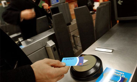
London's Oyster card in use, often used as a role model for Sydney (Source: Guardian)

Development of frameworks for revenue division, performance contracts, and pricing structures for users is critical for a system like Opal to deliver meaningful benefits.


Background

The Sydney Integrated Ticketing project was first announced in 1998 for completion before the 2000 Sydney Olympics. Perth-based ERG was awarded the contract. According to the former NSW Transport Coordination Authority, the User Requirement and contract that stood 2m high when printed on A4 paper.

In 2003, with the project still far from delivery, I anticipated in a contrarian Transit Australia feature article that fare complexity would lead to an unworkable basis for integrated ticketing. I put the case that the technology was the means, and that the end- revenue collection- had to be sorted out by Government and operators first.

In 2008, the $250m+ integrated ticketing project failed, delivering nothing except for ERG’s near-bankruptcy. ERG cited challenging relationships with disparate operating groups and “complexity of fare structures” as core problems.

Later in 2008 I wrote in Transit Australia on a proposal to progress integrated ticketing in Sydney. This went on to be part of Dr Grarry Glazebrook’s 2009 “Thirty Year Public Transport Plan for Sydney” (pp38-39). This formed part of the Sydney Morning Herald’s campaign on Sydney’s public transport.

Subsequently, two of these recommendations (then adopted as opposition policy) were belatedly adopted by the Keneally government just before losing office in March 2011:
  • Private bus services were rolled into the MyZone revenue sharing framework
  • Mode specific zone-based fares (blue TravelPass etc) were rolled into full multi-modal fares
And a third was acted on upon the new Government coming to power:

  • Sydney’s Trams were rolled into MyZone revenue sharing framework

Despite these advances, Sydney’s zone system remains poorly defined and inconsistent with present and future land use. It is entirely independent of the predominant distance-based fares on both trains and buses. It only applies to periodical usage over periods of one week or more; it is not possible, for example, to get a daily or two-hourly zone fare. There is no geographic discrimination in zone fares for buses and ferries resulting in significant inequity for short multi-modal journeys (e.g whether you use a zone ticket to go 5km on two buses or commute from Manly on an ocean-going ferry you pay the same).

There is a realisation that integrated zone-based ticketing is good, but there seems to be little practical action or understanding of how it might be realised. Though former Premier Keneally seems to have believed she was signing off on a new zone-based fare system in 2011, it is demonstrably not the case. Base fares for bus, rail and ferry remain based on distance travelled on a single mode, not on zone or time.

Even though the multi-ride tickets have been rebranded as “my zone”, they are not zone-based at all, but rather remain nothing more than ride-based tickets! 

Spot the imposter: A Sydney MyZone ticket (2012), A London mag-stripe TravelCard (2009) and an Aahrus, Denmark (2012) zone ticket. The Sydney MyZone ticket is actually not a zone ticket at all, but rather a single trip multi-ride ticket based on 1-2 mile sections developed in the 1940s.

For confirmation of the marginalisation of integrated revenue collection and distribution, one need look no further than the discussion paper recently issued by the NSW Independent Pricing and Regulatory Tribunal (IPART) for pricing determination on Sydney Ferries.

Sydney Ferries is the first privately operated franchise within NSW Government controlled public transport network, and is to be the first system switched over to the new Opal smart-card late this year. Despite this, there is no mention of how revenue share will be determined from integrated multi-modal journeys under Opal. In fact, in the current cycle of price and price-structure determinations, the last before the implementation of Opal, IPART indicates that new integrated price structures for ferries are out of scope, a matter for later rail fare reviews (see s7.4 p38 here).

Further steps are required now to make Sydney’s public transport revenue collection integrated and sustainable before implementing Opal.

Example of how it’s been done before


Starting off with an international example of how integrated transport systems and pricing successfully evolve, I’ll come back to Sydney.

There are some great international examples of how to do things really well when it comes to public transport service and fare integration. London, until around 2003, was not such an example. Partially because it took a long time for London to “get it right”, and partially because of London’s familiarity to many Sydneysiders, it is actually an informative case study.

What we’ll see as we walk through the timeline, is that the technology, though an enabler, is only a small part of what brings an integrated ticket pricing framework to fruition.


Her Majesty the Queen tries out Cubic’s revolutionary ticket barriers at the 1969 opening of the Victoria Line in London
  • 1969: The start of modern revenue control in London. Cubic’s high performance pneumatically-powered ticket barriers were essential to getting large number of people into and out-of the new Victoria Line stations quickly. Coupled with electronic ticket machines and a computerised back-office, it became possible to track revenue and protect revenue as never before.
  • 1981: Greater London Council implemented zone-based ticketing, covering both Tube and Buses across two zones. Passengers could now seamlessly transfer between buses and tube trains on periodical tickets (weeklies, monthlies, etc)
  • 1983: TravelCard launched across five London zones. The bus/ tube zone pricing now had higher granularity and greater geographic scope.
  • 1985: Revenue sharing agreement concluded between British Rail and London Transport, enabling full multi-modal CapitalCard. Now the foundation for full multi-modal integrated ticketing was enabled for across bus, tube and train.
  • 1989: CapitalCard merged into TravelCard. 
  • 1998: Prestige Private Finance Initiative (PFI) initiated between the Government Transport for London (TfL) and TranSys consortium to take over revenue collection management and implement Oyster smart card. 
  • 2003: Oyster card rolled out, zone TravelCard system shifted onto Oyster and new “pay as you go” stored value overlay introduced for one-off trips. Crucially, the “pay as you go” stored value fare-cost does not exceed the equivalent daily TravelCard cost. The zone-based TravelCard model defines the upper-limit.
  • 2008: Tfl Purchased Tramtrack Croydon Ltd PFI (Croydon Tramlink) in part due to an increasing shortfall in revenue as a consequence of the 2006 inclusion of TCL in the TravelCard revenue sharing framework
  • 2008: Prestige PFI terminated seven years early, TfL assumed TranSys assets (brand, equipment etc) and established direct maintenance with Cubic
  • 2010: Oyster Pay As You Go valid on National Rail lines across greater London

Over this 40-year history, technology was an enabler, but only a small part of what delivered the seamless, integrated-pricing Oyster system we know today. There are two key developments here: pricing by geographic zone and complimentary revenue distribution agreements. I’ll just flesh these out a little more, and then I’ll come back to Sydney’s progress on the timeline.


Geographic Zones Critical

The establishment of geographic London’s zones in 1981 as a basis for pricing (as distinct from individual rides on individual buses etc) was the first big step. This meant pricing was no longer a function of how many times you got on-and-off the bus or tube, but rather a generalised approximation of usage of a geographic area and time period.

This is the fundamental enabler of flexibility in urban transportation that users have come to expect from their cars. In urban planner parlance, this step represented the removal of flag-fall “fare penalties” on multi-modal chained trips or broken journeys within the zones.

Just to give a specific example of the kind of difference this makes, it means that a passenger can take a break in their journey, say to pick up some groceries at a shop on Oxford Street (be it London or Sydney!), and not pay an additional fare. This does not cost the operator any more, and zone and time based ticketing means that it doesn’t cost the passenger any more either.

It is not broadly understood (and was ignored in Sydney’s previous attempts at a smart card system) that the zone system is the foundation of today’s Oyster card. The “electronic purse” or “Pay as you Go” provides trip-based fares for occasional usage, but this is only up to the envelope defined by the underlying zone TravelCard system.

Fare Zone map for the Zurich Verkehrsverbundes (ZVV) . Zurich, like Hamburg, was an early adopter of integrated multi-modal zone-based ticketing.

On an aside, though TfL are often cited as an example in Australia, the credit for this move towards zone fares and the broader movement to integrated transit planning and management does not go to London Transport or TfL. Credit goes to Hamburg: the Hamburger Hochbahn Aktiengesellschaft zone system implemented in 1963, which was incorporated into the Hamburger Verkehrsverbunes (HVV) in 1967.
The rationale for zone fares and integrated revenue distribution, as now exists in London, Melbourne, Brisbane, Perth, etc, can be found on pp 11-15 of this 1967 UITP paper I scanned.


Revenue Division Challenging


It took eight years to get London’s BR heavy rail system into the integrated TravelCard System for a very good reason: it’s tough getting the different operators with sometimes opposing interests to agree with one-another on revenue division. It took another seven years after the implementation of Oyster on TfL to extend “pay as you go” to the Network Rail operators (who have replaced the former state-run BR). Dividing revenue from a single multi-modal clearing house is complex and fraught with challenges.

Agreeing how operators are to be remunerated, in return for delivering what, also overlaps with performance incentives and penalties which are important parts of Government’s interaction with privately operated and/or financed operations including those delivered through a concession, a franchise agreement or PPP/ PFI. If existing or new services are to be delivered by the private sector, knowing exactly from where and why the cash comes in is essential. Every dollar of uncertainty is reflected as a dollar of increased operating cost.

The failure of the Tramtrack Croydon Ltd PFI is particularly illustrative of the complexity. Initially operating on its own independent non-integrated revenue collection framework, Transport for London (or more specifically the Mayor of London) sought to role TCL into the Oyster fare collection system, which necessitated adopting the TravelCard revenue distribution framework. Because there was a gap between what TCL thought it could have earned under its independent price structure and what it got from oyster users, TfL had to pay penalties to TCL.

This unsustainable position compelled TfL to buy out the TCL PFI, as the Mayor’s office explained:

“The current contract requires TfL to make compensation payments to Tramtrack Croydon Ltd for changes to the fares and ticketing policy introduced since 1996.
[In 2007], that payment was £4m, and the rate is increasing annually.
Taking control of Tramtrack Croydon Ltd means that TfL will no longer have to make those payments and will be able to concentrate on improving the network.”

Action required now


In comparative terms, Sydney is approximately where London was in the mid 80s: there are integrated multi-modal zone fares, but they are marginal and yet to be rolled out as a universal, underlying foundation for new technology. Unfortunately Sydney, as with the previous failed ERG contract, remains steadfastly obsessed with technology, rather than addressing fundamental economic, engineering and business challenges that underpin integrated ticketing and revenue sharing.

The current NSW Government came to power with a mandate both to increase private sector involvement in Sydney public transport operation, and to integrate public transport ticketing into a TfL Oyster style system.

Without fare-structure and revenue-source transparency, private franchisees and PFI-style operators are left at considerable revenue risk, of the kind that forced TfL’s purchase of the Croydon Tramlink PFI (CTL). This will invariably lead to forecasting conservatism and loss of economic benefit from private sector participation.

Without expansion of zone-based pricing principles there is no general pricing framework to enable “integrated ticketing” of the kind that enables multi-modal linked trips and broken journeys. Though London’s Oyster card is an enabler of an electronic purse, it is underpinned by a zone-based revenue sharing framework that took more than ten years to develop.

The present agenda of the NSW government pricing tribunal, IPART, responsible for setting fares and structure of fares, shows no progress whatsoever towards addressing either of these principles. Fast policy action is needed if value is to be derived from a $1bn investment in Opal.


UPDATE 27/8/2012


The Government agency responsible for public transport (including Opal), Transport for New South Wales, has this to say in their current submission to the Government's Independent Pricing and Regulatory Tribunal:


Opal CardThe Opal Card and electronic ticketing system will be rolled out on CityRail services during 2013-14. Opal will be a pay-as-you go system which will automatically deduct the correct fare from stored value on a customer’s Opal Card. The system is being designed so that passengers do not have to decide which ticket or tickets that they need to buy before they travel. Instead, they will be able to travel across the public transport network using one card and, regardless of whether they are using a bus, train or ferry – or where their journey starts and finishes – the Opal Card system will work out the fare for their trip combination.The Government will make further announcements about how the Opal Card will operate before the roll out commences in late 2012. 


This seem to confirm hardware role-out will indeed precede development of the mechanisms necessary to deliver integrated ticketing.


UPDATE 22/9/2012


The New South Wales Government authority which sets prices for transport, The Independent Pricing and Regulatory Tribunal (IPART), has recommended that Sydney Ferries be removed from integrated multi-modal fare system, currently known as "MyZone1". IPART says on page 4 of their fact sheet:

we recommend that the additional subsidy for ferry travel offered by MyMulti1 tickets be removed and that these tickets are no longer valid for travel on Sydney Ferries.


The methodology by which IPART ascertained or quantified this "additional subsidy" to which they refer is not clear. This is not to mention the loaded terminology of "subsidy" for multi modal journeys. I suspect these numbers are generated from a methodology similar to that of the former Total Value of Travel study or TVT used on the former TravelPass revenue sharing framework. This methodology is seriously flawed, as per my 2004 IPART submission (Section 2, p13). I'll be looking further into this over the coming weeks and will write another post when more information becomes available in a final determination.

The proposed removal of Sydney Ferries from intermodal penalty-free commuter fares, on the eve of implementation of the planned Opal smart card, is a dark irony indeed; and one in diametric contrast to the example of TfL's approach to Croydon Tramlink and integrated ticketing in London.


Wednesday, July 25, 2012

INCENTIVISING UNSUSTAINABILITY IN AUSTRALIAN TRANSPORT


No matter the political stripes, Australian governments’ fiscal policies have had a negative impact on urban transport for over 25 years. Taxes on private cars and trucks have consistently fallen, whereas tax on public transport has consistently increased. Perversely, the most recent price signal against public transport to be enacted by the Australian Government is the Carbon Tax: a tax which is claimed to be in service of the environment!

Increased tax on certain products and services is a useful strategy for simultaneously increasing Government revenue and achieving some social end- like discouraging alcohol or tobacco consumption through price signals. Additional taxes are also sometimes levied on “wealth” items like luxury cars, where there is a greater willingness to pay, and a greater opportunity to extract revenue. The last three decades of public transport tax increases (and car/ truck tax cuts) are similar in action to these other taxes.

Sustainable Transport


Public transport and rail-based transport offer very significant efficiency gains over cars and trucks, both in terms of energy consumed, and space/ land consumed.

UITP image from 1955 brochure "There's still time to stop traffic choking our towns"
Image: UITP 1955 brochure "There's still time to stop traffic choking our towns"

  • Rail-based freight requires only one-third (or 33%) of the energy to move goods over a given distance. There is an inherent energy efficiency gain from the use of a steel wheel on a steel rail (as opposed to an air-filled tyre on tarmac). At present the economics for freight rail are heavily skewed by infrastructure access cost: whereas road trucks primarily use roads built and maintained out of government consolidated revenue, rail freight operators have to pay for access.
  • A single lane of metro or rail rapid-transit can convey 40,000 people per hour- that is 20 times more people than can be moved in the same lane by cars at the average occupancy (1.4) per car. Rail rapid transit requires only 5% of the land space to move the same number of people as cars- and you don’t need parking!


So, public transport and rail-based transport offer a very significant contribution to environmental sustainability aims. The numbers are overwhelming- far more so than say the contribution of renewable energy, on which there has been so much recent media attention. We might therefore expect a government taxation approach that increasingly encourages public transport and rail-based transport rather than individual cars and trucks. Bizarrely, the exact opposite is the case in Australia.

Timeline for fiscal price signals in Australian transport


1986:  Fringe benefits tax relief on cars introduced but not public transport fares

2000: Cut new car sales tax from 22% to 10% (on implementation of GST)

2000: Increased tax on public transport from 0% to 10%

2001: Petrol tax changed from indexed to a flat rate, resulting in a fall in retail petrol tax from 50% in 2001 to approximately 30% today (at AUD1/litre before tax), and continuing to regress with inflation. Excise was previously a Per Centage (indexed) but was changed to a fixed price Also see the Australian Tax Office current rates

2012: Applying carbon tax to urban rail power supplies (but not retail car petrol)

2012: Appling carbon tax to rail diesel but not truck diesel through reduced fuel tax credit entitlements (Australian Government Clean Energy Future press statement)

2014: Applying carbon tax to urban passenger bus diesel over 4.5tonne GVM (but not car petrol) (see busNSW Bulletin, July 2012, p16)

Two of the largest taxation reforms in Australia’s modern history (GST and Carbon Tax)  have both struck blows to the most efficient forms of transportation, in favour of unsustainable, comparatively dangerous, oil dependent, high carbon emitting forms.


Political Opportunism or Ignorance?


It is easy to imagine that this ridiculous outcome could be a product of political opportunism. Increasing taxes on (electorate majority) drivers and trucks, to the benefit of rail, could have adverse electoral consequences. But evidence suggests this outcome is a product purely of inaction and ignorance. Indeed many of Treasury’s inquiries like Australian Treasury Fuel Excise reform paper are either scant on, or totally ignore, price signal implications on urban transport.

If these tax changes were about political expediency, it would have been good enough to have just kept the historic balance between car, truck, bus and train. That would not have rattled the cage of motorists and trucking companies.

The fact that the fiscal price-incentive for urban transport efficiency has degraded over so many axes suggests it’s accidental. It seems simply a failure of Treasury to consider the price signal implications of fiscal changes on urban transport.

Interestingly, despite the tax price-signals running consistently against public transport and freight rail, they have continued to enjoy growth as recently reported by the Department of Infrastructure and Transport. Imagine what might happen if the fiscal landscape was re-levelled to that of 1985?